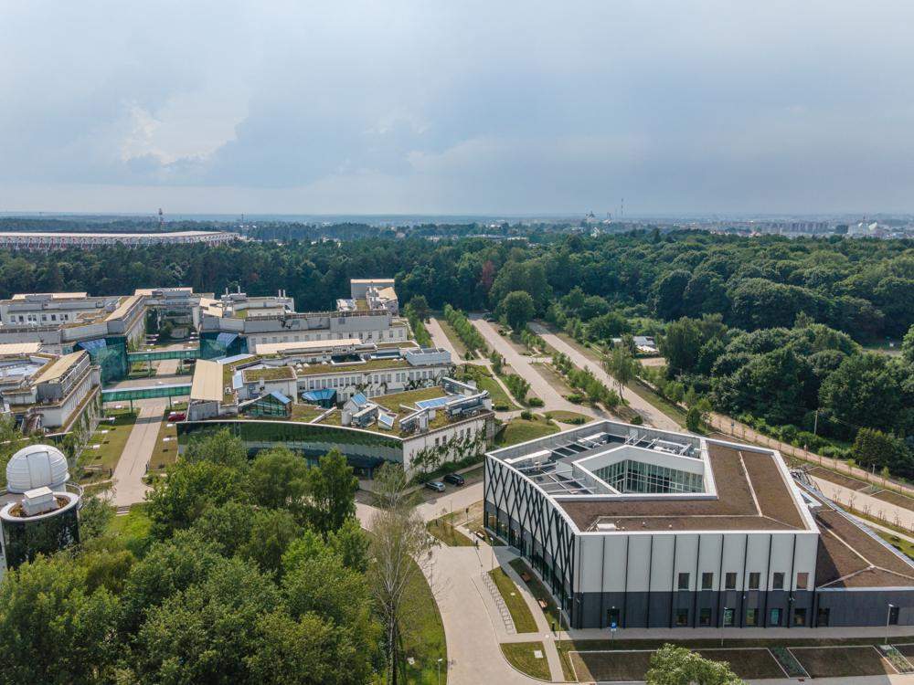
It’s the first academic semester since the completion of the construction of the Jerzy Giedroyc Library. in the center of the new university campus. Architects and designers from the DEMIURG Project office designed a distinctive pentagonal block with an open atrium, playing with form and exploring ways to modify the typical functional layout of such buildings.
The main urban layout of the campus, including some of the faculties, was built in 2015 based on a design by Professor. Marek Budzynski, on the site of former allotment gardens adjacent to the Zwierzyniecki Forest Nature Reserve. The area designated for the future library was located at the so-called “library”. Sunny Square – a circular bypass of the astronomical observatory.
Investor’s Guidelines
In 2017, commissioned by the University of Bialystok, designers from DEMIURG Project began work on the conceptual design of the building. The facility was to replace the previously scattered archives and create a space that meets not only the current but also the future needs of staff and students. The investor, to start the work, was prepared very meticulously. He had previously conducted studies of similar facilities, on the basis of which he developed a complex and fairly unambiguous functional-utility program. The process of its creation involved inspectors from all trades, those responsible for the day-to-day maintenance of existing campus facilities, and the staff, students, and academics themselves. Not only were the parameters of all rooms determined, but, among other things. Climatic requirements for storing collections, as well as the strength and quality conditions of all built-in materials. As users themselves later admitted, they expected that with such detailed guidelines, the project would not surprise them in any way.
Architectural concept
In terms of the form of the building itself, the idea for a pentagonal shape came quickly and was, in a way, an obvious continuation and emphasis for the designers of the existing urban layout based on sections of a circle. The sweeping angle between the outer walls adjoined the radially spreading streets and plotted a central building with a strong shape and compact body. It was a simple form, and in some ways alluded to archetypal ancient edifices. The challenge, however, was to create a functional layout in such an unusual shape. Firstly, the 12,000 linear meters of library collections were to be stored on sliding shelving, which requires a room with a rectangular shape that allows parallel placement of the running rails. It was also necessary to take into account the possible expansion of the warehouse and the need for future developments. With the required room area calculated, dozens of possibilities with different proportions and locations in relation to the pentagonal shape of the outer walls were drawn. In the end, one of the proposals coincided with the planned exterior shape of the building and allowed common structural elements to be carried out between floors. The central positioning of the warehouse was not only symbolic but also functional. All the offices of the employees who work with the collections on a daily basis were located around the depot, and with fewer exterior walls, it was less vulnerable to changes in temperature, humidity, and access control fractures. The offices, on the other hand, offered a view of all the vegetation surrounding the building. The view from the employees’ windows, although it may seem a secondary issue, was one of the functional conditions for the architects. They wanted the people who spend the most time on campus to be the beneficiaries of the implementation of the project idea.
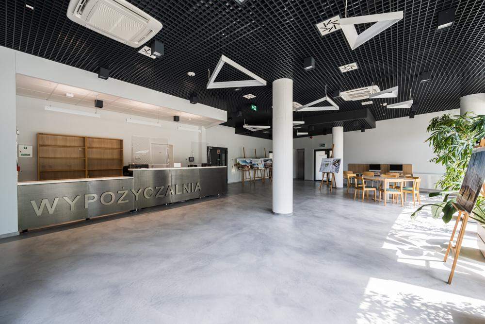
As you might also guess, the proposed functional layout itself came as a big surprise to the librarians. All the modern libraries surveyed have a clear division into two parts – one for staff and the other for readers. Both have different requirements in terms of not only functionality, but also access control, climate control, or structural loads. The entire investment program, drawn up before work began, as well as preliminary discussions, also focused on such a division, understood as two separate wings of the facility connected by a common lobby. In the end, however, the architects took a risk, moving the horizontal functional axis to the vertical plane. Instead of dividing the building into wings, the first floor concentrates the entire staff area and a spacious lobby, from which readers are led further to the floor and mezzanine. Such an unusual layout made it possible to maximize the use of sunlight, acoustically separate different parts of the building, invisibly protect the collections from being carried away, but also to make the most efficient use of space to leave as much room as possible around the facility for new plantings. The traditionally built staircase and elevator have been complemented with light and visible stairs that relate to the shape of the building and connect successive spaces for readers, from the entrance hall, through the reading room, to individual and group workrooms.
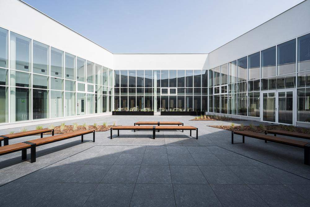
The culminating point of experiencing the building was moved from the lobby to the reading room, which, as the place where people actually interact with the collections, was to have the most representative role. The entire space is more than 5 meters high and opens to an interior glass atrium. A string of circular pillars slid into the room, blurring the boundary between indoor and outdoor space. This was also a procedure that allowed the informal enlargement of the reading room without exceeding, strictly defined by the Investor, the maximum usable area. A mezzanine floor has also been designed in the reading room, located at the outer walls of the building, above the open collection storage areas. Also located around the atrium are a conference and training room, as well as a display of President Ryszard Kaczorowski’s cabinet. All of these rooms are connected by a common communication, with the principle that spaces accessible to all face the open middle, and those used intentionally and subject to access control are located at the outer walls. The Atrium is intended to be a stage for spontaneous events, grassroots initiatives, and the very creation of bonds between users. A small stage with an audience, space for low and climbing vegetation, and space for movable furniture and displays have been placed on it.
Despite such an extensive function, the architects of the DEMIURG Project studio wanted the building to be user-friendly, and this means to a large extent, the ability to easily find their way around the surrounding space. The library is not a maze of complicated corridors, long paths by which people transport books every day, but instead an organism with a visible center from which all communication spreads as in a bloodstream.
External form
The outer form of the building was to intertwine and complement the inner form, which is why monochromatic and contrasting colors, highlighting the geometric division of the building, also dominate inside. Oscillating only on distant parts of the gray scale was intentional – through them, the building is a background, for the surrounding context. From the outside, natural vegetation should take the lead, and inside, a multicolored collection of books and media.
However, we allowed ourselves a bit of symbolism when creating the building’s facade design. The neighboring buildings are finished on the side of Sunny Square with mirrored panes that reflect the surrounding panorama of trees. We decided to interpret the surrounding landscape with modern methods, reflecting on the facade not the full image of the trees, but their geometric simplification. This contemporary relief, with a structure reminiscent of a computer image or graph, is at the intersection of the world created by nature and man. – Inga Rolek, Chief Architect
The front elevation was one of many elements that fit into the context of the surrounding modern architecture. Previously built departments embodied the idea of the symbiosis of technology with the local biome. The architects of the DEMIURG Project did not want to imitate solutions from previous buildings but considered it most sincere to understand and attempt their own response to the problems faced by the designers of neighboring buildings.
Instead of analyzing the neighboring buildings, we went back to the articles from the period of the campus’ creation, written by the authors and Prof. Marek Budzyński. They were dominated by references to integrating people with nature, and it was this goal that we also set for ourselves as paramount. – explain Architects
A facility was designed, where the use of the building did not end only within the closed walls. It was a unique challenge while ensuring the security of the collections. From the beginning, all types of land fencing, which are always elements of hostile and restrictive architecture, were rejected. It was decided to create an area around the building in a way that intertwines functionality with the natural landscape. The retention of huge amounts of rainwater was solved by designing more than a dozen shallow ponds, which at the same time affect the local microclimate, create an attractive space for outdoor reading, but will also be a source of water for local animals. The trees in between will provide shade for people, but also shelter and new habitat for local birds. Not even the traditional modern urban furniture was designed, but instead, turf benches grew out of the grounds in the form of sofas and loungers. Although all designed elements, were visibly man-made, as evidenced by the geometric shapes, they were also intended to become part of the natural biome and not only be neutral to the existing environment but even work to its advantage.


