I remember a bit of Lodz from the 1980s. 20th century My mother’s sister and her family lived in Zgierz. When I visited them with my parents, we also drove down to Lodz. This is where I first rode the escalator. It was quite an attraction, as there were not many of them in Poland at the time. These stairs were located in one of the, as it was then called, department stores. I bet it was “Central” on St. Piotrkowska. I just remember the stairs, the open space and the large crowd of people. From those days I also remember a photo of a muddy courtyard in Lodz and some shabby outbuilding where my aunt’s husband was born. What was in the picture was the complete opposite of a modern, light-filled department store. At the time, I didn’t know how to name it. Today I know that the contrast hit me.
When I looked into Central years later, I didn’t recognize the place. The building seemed to have diminished, aged, there was general disharmony in the interiors, and the escalator, probably replaced with a new one, made no impression. On the other hand, walking around the city, I thought that the muddy courtyard in the photo today might be one of Lodz’s vibrant spots or a revitalized, comfortable living space. And again the contrast! The fact that Lodz is a city of contrasts has probably been said a thousand times already. These contrasts are both good and bad. However, I notice that these unpleasant contrasts, not at all slowly, are blurring, and their blurring, as if against semantics, sharpens the qualities of the city. And that’s why I like Lodz more and more. And with this conviction I looked once in a while, on various occasions in Lodz. And then one day Marcin Trybus of King Cross proposed to our company to design a new residential building covering a whole quarter in the city center, on two plots of land at the corner of Kilińskiego and Nawrot streets. Being able to design in such a place is something of a Holy Grail for any architect.
We met Marcin Trybus through the replacement investor MGK Projekt, with whom we have worked many times, and it was he who recommended us. So far we have worked for Marcin on several concepts, which have not entered the implementation phase, including the concept of an investment in another interesting place, although of a different nature. I can’t reveal the details, but the cooperation was probably so good that Marcin entrusted us with the Flora Downtown project. The first signal from the Investor was that we should design large apartments – such 70- 100m2. Great, because apartments of this type are more pleasantly designed than small or medium-sized ones, where every meter matters. Of course, it was also about making the most of the plot. The word “optimal” is important and true here. It does not pretend the word “maximum.” Already after the first meetings and presentation of a simulation of the future usable apartments area, we came to an agreement with the Investor that we would let go of even a few hundred square meters. We wanted to squeeze them out of the plot, in order to create a more friendly space in this place. But let’s talk about it in a moment.
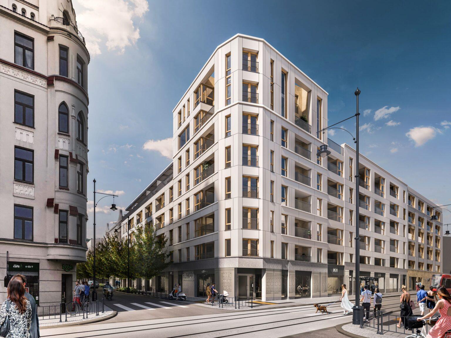
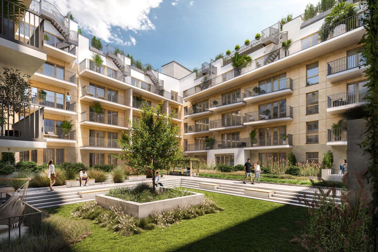
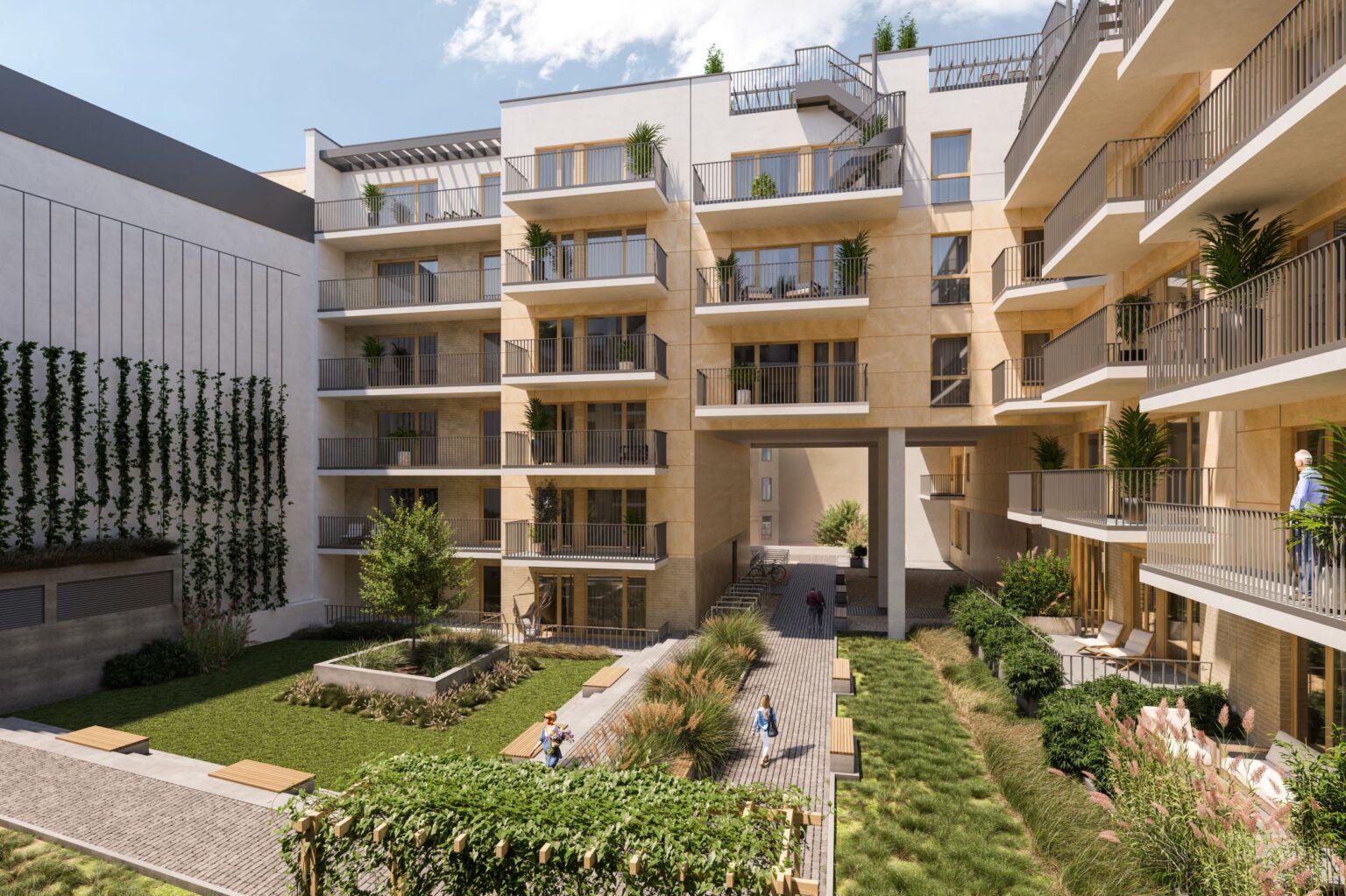
When I arrived for the site, I was struck by the Lodz contrast again. On the one hand, the new surface of Nawrot Street and the great revitalized tenement opposite the squalid parking lot where “our investment” is to stand, and on the other, the chaotic development of Kilinski Street in this section. Kilinsky. There was nothing left to do but face this contrast. With faith that the qualities of the place can be sharpened. Initially, we worked on the urban planning premise. The property on which the investment will be built is located on two plots of land. It is separated from Sienkiewicz Park by only one property. This is the property at 107 Kilinskiego Street. At the front of this plot there is a one-story service building listed in the register of historical monuments, and in the depth there is a residential building whose windows overlook Sienkiewicz Park on the west side. The second neighborhood is a tenement building on St. Nawrot 38 and its outbuilding partially bounding our plot to the west. We wanted the block of the new building to reflect the historic divisions of the property. To this end, a perpendicular to Kilinsky Street was created along the inner boundary and at the same time the historical division. which is a sort of repetition of the buildings’ outbuildings on Kilinsky. This made it possible to abandon the development on the border of the plot with the outbuilding of the building on the street. Nawrot 38. This created a large bright, near-square patio. And on the wall of the outbuilding of the Nawrot 38, we have planned a vine of five-leaf honeysuckle. Residents will have a view of the green wall, and in autumn it will shimmer with a fever of colors.
We dreamed about the air from the park reaching the inside of the courtyard. In order to make this possible, it was necessary to design the cuts of the solid. We proposed that the inner outbuilding and the part of the building adjacent to the tenement building on St. Nawrot 107 have been undercut to a height of 2 stories. This allows a transition from the park to the interior of the quarter. The greenery we planned in the courtyard and along the internal roads resulted in a kind of ecological corridor connecting the park and the courtyard. The undercuts took away about 500 sqm from the usable area of the apartments, but the developer did not treat them as a loss of space, but as an asset of the investment. I think the key to successful implementation is to work with the context. The first stage is to discover this context, sometimes reading it between the lines, and sometimes discovering what you can’t see. The second stage, arguably more difficult, is to build on this context with a new body and the functions that result from this context. In addition to the urban layout and the local zoning plan, the context for us was the architecture of Lodz’s streets.
The general architectural reference of the new building is the tenement on the opposite corner of Nawrot and Kilinskiego streets. Here we looked for proportions, color and grandeur, and even previewed how the first floor of the building was resolved. This was the closest context. However, we were looking for a broader view. As I pondered the phenomenon of Lodz’s architecture, I saw magnificent townhouses that together create the unique atmosphere of the downtown area. The neighboring tenement is great, but if it were moved to, for example, Poznan, probably no one would realize that it is a tenement from Lodz. In fact, the same would be true of most other tenements. At some point, however, I noticed that the rusticated first floors were quite characteristic of Lodz. I have the impression that such an accumulation of them is not found in other cities.
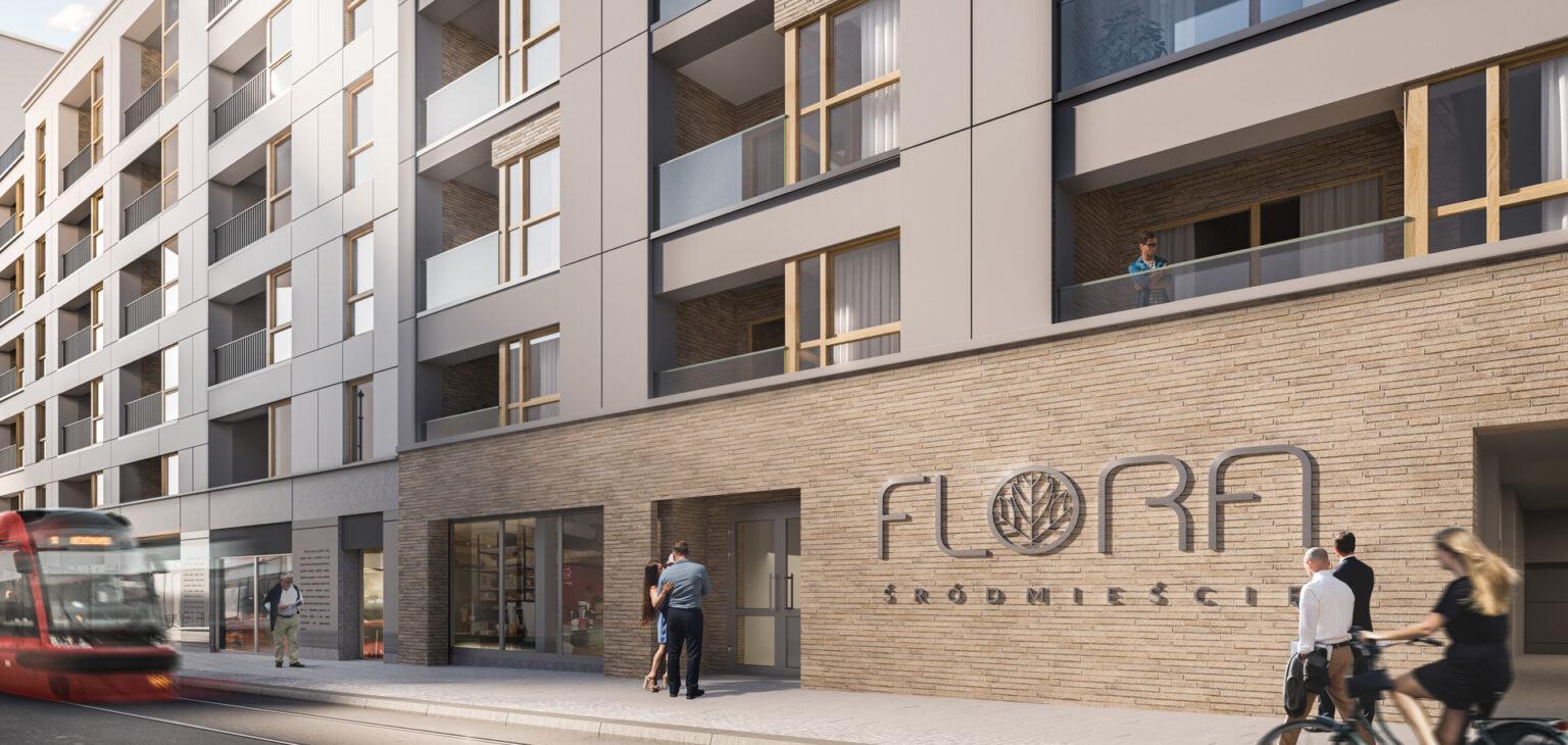
Looking for other clues, the first association with Lodz, besides childhood memories, is “Promised Land.” The most Lodz-ish of Lodz is literature. Confronting literature with architecture, the idea arose to treat the lines of text as a kind of rustication. This gave birth to the idea of glass panels forming the first floor of the building, covered with quotes from Reymont’s work. In designing the corner, we performed an analysis of the corners of Lodz tenements. This was a surprising experience, because from this analysis it emerged that in general they are overly modest in terms of articulation and detail, that they are the opposite of the richly decorated and sculpted frontages. And we actually repeated such a corner in our project. Interestingly, this conclusion also came as a surprise to the conservationist we spoke with at the concept stage.
The plot on the corner of Kilinskiego and Nawrot Street is located in the conservation zone as an area of historical urban layout and cultural landscape under the name of “Settlement of Flax Spurs”. It is listed in the municipal register of monuments. Hence the need to obtain approval from the Office of the Provincial Historic Preservation Officer.
The first conversations were not easy. The maintenance lady was not convinced by our initial vision. She negated how we solved the first floor, despite the fact that the idea of a facade with quotes from “The Promised Land” appealed to her. It also accepted quite quickly the material of the building’s facade on the side of Nawrot and Kilińskiego streets, where we proposed fiber-cement board cladding. What she didn’t like was the height of the building and the way we accented the corner. However, I had the impression that we were talking about subjective feelings, because the concept presented in our opinion met the requirements of the local development plan.
Characteristic of our plot is that Kilinsky Street rises along its length by 1m. A provision of the local plan says that the first floor height of the building should be min. 4 meters from street level, and on the other hand limits the height of the building to 21 meters from the lowest entrance. This raises complications regarding the possible number of floors and their height. The local plan also enforces that the subdivisions on the façade on the side of St. Kilinsky mark the historical division. In short, the idea is to shape the facades so that they can be read as separate buildings. We wanted to reconcile the impossible with the possible, and designed this facade to make the division between the two buildings as obvious as it was unobvious, but harmonious.
First, we had to convince the preservationist that our proposals – including the height of the building – were in line with the provisions of the Local Development Plan. Next, an aesthetic consensus had to be found. We were referred to another Lodz development to try to follow the solutions there and try to implement them in our building. The result was unpalatable to us as designers, but also to the conservationist. However, this turned out to be somewhat of a breakthrough, because then, she seemed to look more kindly on the previous concept, and as a result, we returned to it.
As for the corner that was mentioned. Initially we accented it with a glass facade, which did not gain approval. The objection was not the fact that the facade was used, but its proportions, which I disagreed with at the time. We decided to perform an analysis of Lodz corners. The surprising result of this analysis was incorporated into the next version of the concept. In addition, some of the proportions and articulation of parts of the first floor were corrected, and in this edition the concept was, somewhat unexpectedly, accepted. However, I must admit that as a result of the interaction with the conservationist, the project has gained a lot.
It was important for the investor, as well as for DEMIURGA, to introduce ecological solutions in the building and its surroundings. In addition to the greenery, which aimed to harmonize the relationship of residents with the urban environment, another manifestation of this approach is rainwater retention, which in today’s, one might say turbulent times, and I mean weather, is actually essential. The courtyard of the building will be created above the first floor. Rainwater will be partially retained in the layers of its floor, which will be constructed using green roof technology. In addition, the building will include a rainwater harvesting tank. In addition, the investment will provide charging areas for electric cars and storage space for bicycles. We also took care of the appropriate heat transfer coefficients for the partitions and windows.
While we were working on the concept, market dynamics accelerated and every now and then a decision was made that we would downsize the apartments, and the result was a project that offers large, luxury apartments, over 80 to over 100m2 including duplexes, medium-sized apartments of about 70m2 and smaller ones from about 30m2 upwards. The cross-section is large and investors with different portfolios will find something for themselves.
Frequent changes in the functional concept, struggles with the Preservation Office, the existing terrain and the neighborhood of buildings in poor condition, as well as the scale of the project itself, requiring a considerable amount of time for coordination, are all pieces of the puzzle that need to be put together. This is, on the one hand, the usual work of a project team, and on the other hand, each time a different sequence of problems, similar to each other, but often surprising and not allowing for routine.
When the final form of the building starts to become visible, when more and more details start to fit together and a harmonious whole appears, I then say that the object emerges from the chaos. It’s fascinating to be able to observe this.
However, the most important phase is the implementation phase. Ultimately, it is what makes a success. We will still have to wait for that, but I hope that the facility will be one of those that blurs the bad contrasts and that it will give Lodz another interesting development worthy of its potential.
Author: Krzysztof Kaczmarek, Architect DEMIURG
Investment: Flora Downtown
Investor: King Cross
Designer: DEMIURG Project S.A.


